Category Archives: TS-SystemChecker

Day Trading the 30-Minute Breakout, Again

The 30-Minute Breakout: A Classic Strategy Built on Simplicity

It seems like it is a good time, based on performance, to take another look at this simple model.  Just like bell bottom jeans, this simple approach flows in and out of fashion.  I revisited this strategy in my 2023 Easing Into EasyLanguage – Day Trading Edition book.

Most day traders spend hours glued to their monitors, constantly scanning charts and second-guessing every tick. But some of the most effective strategies take the opposite approach: one trade per day, simple execution, and fixed risk.

Back in 1998, I was sitting in a crowded ballroom at a trading convention in Orlando. The keynote speaker stepped up to the stage, pulled up a PowerPoint presentation, and unveiled a strategy that was already considered an “oldie” back then.  We had actually been trading derivatives of this approach for more than 15 years at this point.

“Oldie” is probably an appropriate word to use—the core concepts of the Opening Range Breakout (ORB) and the Opening Range Breakout with Pattern (ORBP) had already been floating around the industry for over two decades.

In fact, one of the most exhaustive works on the subject was published back in 1990 by Toby Crabel and released by my friend Ed Dobson at Traders Press: Day Trading with Short Term Price Patterns and Opening Range Breakout. Following the multi-billion-dollar success of Crabel’s firm, Crabel Capital Management, that single out-of-print hardcover became a true holy grail item—regularly fetching anywhere from $500 to over $1,000 on the secondary market.

You can even watch the team at Crabel Capital discuss how those core quantitative principles scaled up in this J.P. Morgan featured interview.

Getting back to 1998 – Looking around the room, people were transfixed. Slide after slide showed successful breakout after successful breakout.

Even today, breakout trading remains one of the most widely used entry techniques across the market. Why? Because this specific approach checks almost every box a trader could want:

  • One trade per day — Essential for preventing revenge trading, though modern market microstructure often causes early breakouts to fail. Hard-coding a rule to fade that initial failed move can actually turn a false breakout into a high-alpha opportunity.

  • No screen-staring — You don’t need to sit at your desk all session.

  • Defined risk — Built-in protection and zero overnight risk.

  • Easy automation — Follows the Keep It Simple, Stupid (KISS) principle to a T.

Here is how the classic setup works:

  1. Wait for the Setup: At 9:55 AM Eastern, look at your 5-minute chart. Wait for that 9:50–9:55 AM bar to close (completing the first 30 minutes of the trading day).

  2. Set Your Orders: Place a buy stop order one or two ticks above the highest high of those first six 5-minute bars, and a sell short order one or two ticks below the lowest low.

  3. Execute: Wait for one side to trigger. As soon as you get filled on one side, cancel the opposing entry order and convert it into your liquidation/stop-loss order.

  4. Manage Risk: Early market volatility can sometimes create a range that is too wide for your risk parameters. If the dollar risk between the channel high and low is greater than your personal risk tolerance, use a pre-set disaster stop or simply skip the trade.

Trading doesn’t have to be complex to be effective. Sometimes, stepping back and letting a classic rule-based strategy do the heavy lifting is the smartest move you can make.

Step 1: Fire Up the Code Editor

When a strategy with this kind of mileage crosses your desk and catches your eye, your first job isn’t to start placing trades—it’s to translate it into code.

Now, since the rules fit on the back of a napkin, you’d naturally assume writing the script would be a piece of cake. You can even prompt your favorite AI to whip up the code, and to its credit, it’ll get you about 80% of the way there. But as any veteran EasyLanguage programmer knows, the devil is always in the details. There’s almost always a sneaky little hiccup lurking in the logic—whether it’s an off-by-one error in your bar counts, a weird multi-data alignment issue, or an order that fills when it shouldn’t.

More importantly, build parameterization into the code from the beginning. The goal is not to curve-fit the past into a fragile illusion of perfection, but to find parameter ranges that place the strategy in the right ballpark for today’s electronic markets. Risk and reward characteristics evolve as stock indexes reach new highs and volatility changes with them.

Email me at george.p.pruitt@gmail.com to get the EasyLanguage source code.  

Here are the key variables I always like to isolate and test:

  • The Breakout Window: The 30-minute opening range is a classic that’s been around since the floor-trading days. But is 30 minutes still the magic number? Opening up a search space for 15, 30, or 45-minute ranges lets the data tell us how modern volatility behaves.

  • Capital & Trade Risk: On fast-moving contracts like the ES or NQ, a wide 30-minute opening bar can yield a stop-loss distance that’ll blow right past your account’s risk budget. We need a disaster stop override.

  • Profit Targets: Riding a trade to the final bell sounds great in theory, but late-day momentum can turn on a dime. Testing defined profit objectives helps us figure out if taking money off the table beats hoping for a strong closing bell.

  • Break-Even Triggers: Let’s face it—false breakouts happen, and in today’s algorithmic environment, they happen a lot. Introducing a break-even stop once a trade moves a certain number of ticks or dollars into the green can salvage capital when the initial push was purely manifested by stop runners.

  • Adding the Pattern to the ORB:  If you allow this simple strategy free reign it will almost certainly trade every day.  In this simple test we could utilize some of Toby Crabels volatility constraints.
    • NR-7:  Yesterday must be the narrowest range of the past seven days
    • NR-4:  Yesterday must be the narrowest range of the past four days.
    • TR vs. ATR:  Compression or expansion.  Was yesterday’s True Range greater than or less than the 20-Day Average True Range.

Here is the analysis from July 2018 through July 2023.  I picked this period because this is when I published the book plus five years prior.  Tested on @NQ.D without commission and slippage.

  1. Optimize risk versus reward while ignoring break even and range filters:
    1. profit objective from $3,000 to $9,000 by $1000
    2. stop loss: $1500 to $3000 by $500
  2. Optime risk versus reward versus breakeven ignoring range filters
    1. profit objective from $3,000 to $9,000 by $1000
    2. stop loss: $1500 to $3000 by $500
    3. break even stop from $1500 to $2000 by $250
  3. Optimize range filters
    1. NR4
    2. NR7
    3. Range compression and expansion

3-D Visualizations and Discussion

Optimzation 1:

Objective function:  Net Profit

Reward.  Nice results across a nice high and level plateau.  The strategy wants a lower risk per trade, but it wants the profits to run.

Objective Function:  Maximum Draw down
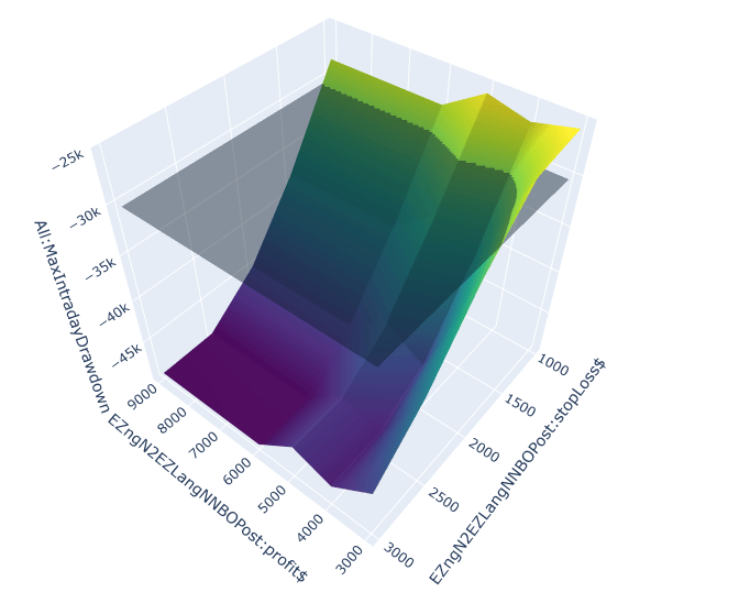
Risk.  Well, we are dealing with AI and Mag7 volatility here.  Very few results with less than a $30K draw down.  We are bumping up against the wall risking $1000 per trade.  We could push through the wall but I personally don’ think it is worth the effort.

Optimzation 2:

Objective function:  Net Profit

Plotting two parameters on a 3D chart is straightforward. Adding a third requires an extra step. We can still plot a result at each X–Y coordinate, but multiple results may now share that same coordinate because of the third parameter. To create one surface, we accumulate those results and plot their average at each unique X–Y location.

Reward.  Nice results across a nice high and level plateau, again.  The introduction of the Break-Even optimization changed the surface.  Remember we are looking at aggregate statistic at each X and Y not just one point.

Objective Function:  Maximum Draw down

Risk.  This was somewhat surprising.  The Break-Even addition returned all values (when averaged) at each X and Y between -$20K and -$30K.

Heat Map of Risk (3 parameters).  A chart like this is hard to see unless you rotate them.  I like to look at a Heat Map as well.  The following map shows a lower draw down values at lower stop loss and profit objectives.  Logical, right?

Heat Map of Risk (2 parameters).  What does the 2 parameter optimization heat map look like?

I think we can conclude the application of a Break-Even trade as a plus for the system.  Very few X and Y show desirable results.

Trade Filtering – Good or Bad:  Neither NR4 or NR7 were productive.  However, comparing yesterday’s True Range with the ATR produced some surprising results.

This demonstrates we need volatility but not too much volatility.  Trade filtering goes hand in hand with the amount you want to risk.  Filtering trades diminishes executions and therefore reduces exposure.

Final System:

Risk: $2000 – Reward: $9000 – BreakEven: $1500 – Volatility TR < 1.5 X ATR

Walk It Forward

Walked forward from August 2023 – this was the endpoint we used in the optimization process. A good fellow with just a hint of a temper.

Too much money too quickly!

Incubation Assessment
Overall Assessment: Degraded
Risk Assessment: High Risk
Incubation Readiness Score: 4 / 8
Return delivery is running ahead of baseline: expected annual return is 318% versus actual annual return of 434%, and expected annual gain of $39,732 compares with actual annual gain of $54,197. However, that stronger return delivery has come with a less stable path and/or materially heavier risk than history would suggest. Risk is materially worse than the historical profile: actual worst drawdown of $35,005 is 1.720 times the historical drawdown of $20,355. Risk conditions are in the High Risk range. The realized monthly path is no longer tightly aligned with the baseline, based on monthly equity correlation of 0.960, projection RMSE of $55,147, normalized RMSE of 1.388, and path wander ratio of 0.476.

Correlation still shows directional similarity, but the path wander ratio indicates noticeable drift away from the projected path over the same window. Monte Carlo context is cautionary: actual forward equity is $162,590, gain percentile is 78% (in the upper quartile), and drawdown percentile is 84% (in the upper quartile for drawdown stress). Taken together, the system shows meaningful deterioration in incubation.

That flat period at the beginning of the test period looks a little suspect, right?

Monte Carlo It

Running 2500 simulations with $50K initial capital and then extracting a typical year out of the results you get this:

This is what you get when you perform a Monte Carlo analysis over a time period that shows exceptional results.  However, the very best and very worst trades were removed first before the shuffling.

Top left corner is most dense quadrant = GOOD!

Walk it Backward!  Bell Bottom Jeans!

The 30-minute rule during this period of time was dismal.  Just like Bell Bottom jeans in the 1980s.

Is Your System Broken?

The Ultimate Test of Efficacy: Time

At Futures Truth, we focused on one thing: walk-forward results across hundreds of trading systems. Back then, the industry was unrecognizable compared to today—if you can even call what exists now an “industry.”

Just this morning, I was reminiscing about vendors who sold strategies for upwards of $5,000. Those packages usually consisted of a set of rules (disclosed or not) and a rudimentary DOS-based program to generate simple charts and next-day orders. This was well before the heyday of TradeStation; those days are gone forever, for better or worse.

Back then, if a system performed well in walk-forward analysis, it earned a ranking. In those days, a Futures Truth ranking meant something. Sometimes, however, that ranking felt like a curse. Critics even argued you could “fade” a top-ranked system and make more money by taking the opposite trade. The reality is that many of those legendary “Top Ten” systems—built for a different era—simply wouldn’t survive in today’s markets.

Side Bar:  There are still services such as Striker and The Collective that still monitor trading systems.  Striker only shows real execution, which is mostly a good thing – real execution costs are shown.  But so is broker error.  Heck, we are all human and we all make mistakes.  Striker is upfront with this, and they state they will do the best they can – execution can be a beast. 

Speaking of execution – The Sunday Evening Gap

A Traders Nightmare. Most likely Trend Followers were short during the huge gap here!

 Imagine, having a stop order in crude oil on a Sunday evening when the market opens thousands of dollars through your stop.  If a system derived position is short the broker’s only directive is to GET OUT – no matter what, at the first off ramp.  The above chart shows a single contract slip on crude futures at the genesis of the Iran War.

The Million-Dollar Question

The second most common question I was asked at Futures Truth was: “How do I know if the system I’m trading is broken?”

Can you guess the most common one? “If it were your money, which system would you trade?”

We never answered that one directly; there was never a simple black-and-white answer. But the second question—the one about “broken” systems—usually surfaced when a trader was deep in a drawdown.

Seasoned traders know that systems ebb and flow; drawdown is simply the “tax” we pay to play the game. Others, however, get “married” to a system and stick with it until “death do us part.” My standard response back then was always:

“Is your current performance still within the boundaries of the backtest?”

In other words, has the system exceeded its historical maximum drawdown by a meaningful margin? Does the current real-time performance look like other “rough patches” in the historical equity curve? If the answer was yes, the trader would usually give it a little more room.

Into Unexplored Waters

Those were simpler days, but the core problem remains: we cannot see the future. No forward analysis can tell you with certainty what a trading system will do next. What it can do is tell you when the system has moved into “unexplored waters.” Once you know that, the decision to stay, abandon, or pause becomes much easier.

All trading systems oscillate between success and failure. If a system has a genuine technical edge, that edge may eventually reassert itself—provided you have the time and capital to wait. But most traders don’t have unlimited resources.

Recently, the market activity surrounding the Iran conflict has pushed many systems into intense drawdowns. The same old questions have reared their heads again. This time, however, I wanted to provide a more empirically derived analysis. I’ve developed a disciplined approach to measuring risk and reward that moves beyond “gut feel.”

To illustrate, I pulled a system off my shelf that I originally designed for retail consumption back in June 2018. Here is how it’s currently holding up:

Hypothetical Results: Before and after development.

The Profit Mirage

This is a mean-reversion approach. I remember thinking back in 2018: How much longer can this bull market continue? With that in mind, I utilized a simple regime filter. After just a few weeks of trading later that year, I genuinely thought the system might be broken. The market spent a large portion of that fall and winter below its 200-day moving average, and shorting simply wasn’t working.

The system then went dormant for a long stretch, finally “waking up” at the height of the pandemic. Had you stuck with it, you would be up significantly today (though we stopped trading right at the onset of the pandemic).

But here is the catch: Profit, by itself, is not enough to determine if a system is broken. As long as they are making money, most traders never bother to peek below the surface. This system would likely be sitting near the top of the Futures Truth rankings today. But let’s dive in and see how it actually performed on its “test of time.”

Test 1 – Baseline Projection

Baseline projection based on in sample average monthly return.

Is Outperformance Always a Good Thing?

Looking at the chart above, you see a steep deviation below the baseline initially, followed by a rocket-ship move to the upside. By late 2025, the actual equity is sitting way above the red dashed expectation line.

Most traders would see this and think they’ve struck gold. “Isn’t this what we want—a strong positive deviation?” they’d ask.

In a world of simple “bottom-line” thinking, the answer is yes. But in the world of professional algorithmic trading, this chart is screaming a different story. To a seasoned developer, deviation is deviation. Whether it’s to the upside or downside, moving this far away from the “expected” path suggests that the strategy’s original statistical model is no longer in control.

When a system starts generating 190% of its expected return, it’s often because it has inadvertently stepped into a high-volatility regime it wasn’t designed to navigate. If the “upside” is this aggressive, you can bet the “downside” risk has scaled right along with it.

Test 2:  Monte Carlo Analysis on Walk Forward

Return and Drawdown sitting on the tails.

The Statistical Reality Check

To understand why I called this system “Degraded” despite the profits, we have to look at the Monte Carlo Walk Forward distributions. This is where we compare real-time performance against thousands of simulated “alternate realities” based on the system’s history.

1. The Equity Distribution (The Good News… or is it?)

In the top chart, our actual forward equity of $67,575 (the dashed red line) sits at the 97th percentile.

  • Interpretation: Out of 1,000 possible outcomes, the system performed better than 970 of them. While this looks great, being this far out on the “tail” of the distribution suggests we are no longer operating in a normal environment.

2. The Drawdown Distribution (The Warning)

The bottom chart is the real story. The actual worst drawdown reached $18,588, placing it in the 98th–99th percentile of severity.

  • The Comparison: The median expected drawdown was only $8,125.

  • The Verdict: We have blown past the 90th percentile of $13,611 and are deep into the “danger zone.”

The Bottom Line

When a system hits the 97th percentile for gains but simultaneously hits the 99th percentile for drawdown stress, the math is telling you that the character of the strategy has changed. You aren’t just trading a system in a “rough patch”—you are trading a system that has moved into a risk regime it was never built to survive. This is the “evidence-based framework” I mentioned earlier. Without these charts, you’re just guessing. With them, you have the data to justify stepping aside.

The Verdict: Test 3 – Overall Assessment

This is where the “gut feel” ends and empirical analysis begins. The following commentary is generated by my new software; a quasi-expert system designed to pair raw statistical results with descriptive, actionable interpretation.

Status: DEGRADED

Risk Assessment: CRITICAL RISK

Incubation/Trading Readiness Score: 4 / 8

Overall Assessment: Degraded
Risk Assessment: Critical Risk
Incubation/Trading Readiness Score: 4 / 8
Return delivery is running ahead of baseline: expected annual return is 18% versus actual annual return of 34% and expected annual gain of $4,477 compares with actual annual gain of $8,536. However, that stronger return delivery has come with a less stable path and/or materially heavier risk than history would suggest. Risk is materially worse than the historical profile: actual worst drawdown of $18,588 is 2.670 times the historical drawdown of $6,962. Risk conditions are now in the Critical Risk range. The realized monthly path is poorly aligned with the baseline, based on monthly equity correlation of 0.960, projection RMSE of $21,789, normalized RMSE of 4.867, and path wander ratio of 0.621. Correlation still describes directional similarity, but RMSE and path wander ratio show how far the realized path has wandered from projection over the same window. Monte Carlo context is cautionary: actual forward equity is $67,575, gain percentile is 97% (near the top of the simulated distribution), and drawdown percentile is 99% (in the worst decile for drawdown stress). Taken together, the system shows meaningful deterioration in incubation.

A readiness reading of 4 out 8 indicates this system right now has degraded to a point where caution and I mean extreme caution should be used in your decision to trade this strategy.  The major factors influencing rating are:

  • Return Attainment:   1.907 – — This indicates the system has achieved 190.7% of its historically expected return during the incubation/trading period. In practical terms, the strategy is generating returns at nearly twice the pace implied by its historical baseline.
  • Path Wander Ratio: 0.621 — This indicates that the actual equity path is deviating from the projected path by a meaningful amount relative to the total expected move over the incubation/trading period. Put simply, the system is not wildly off course, but it is no longer tracking the historical baseline tightly.
  • Drawdown Stress: 2.67 — This indicates that the actual worst drawdown has expanded to roughly 2.7 times the level suggested by the system’s historical baseline. Put simply, the strategy may still be generating return, but it is doing so while absorbing far more pain than its historical profile would justify.

Hindsight is always 20/20, and it is easy to say now that you should have stuck with the system. But with a large sample of out-of-sample trades showing this degree of deterioration, if I had to choose between staying with it, abandoning it entirely, or temporarily shutting it down, I would probably step aside and wait for conditions to settle down. Remember, not trading is an algorithm too.   Having the right tools to make this kind of decision is paramount, because they give you an evidence-based framework for explaining and defending your reasoning.

The Power of Incubation: Is Your Best System Collecting Dust?

How many systems do you have sitting on your shelf? I personally have at least a hundred, probably more. In this business, a little dust is not always a bad thing.

Figuratively speaking, the more “dust” a system has collected, the more real-time incubation it has endured. And that gives you something far more valuable than any backtest: pure, unadulterated out-of-sample evidence.

Seeds Waiting to Be Planted

Algorithmic trading development rarely produces just one system. It creates a trail of offshoots—versions that may have looked unremarkable or even mediocre during the initial build. Yet many of these forgotten systems are really just seeds waiting for the right environment.

When you revisit them months or even years later, you may find that a strategy which struggled in 2022 has bloomed into a powerhouse in 2026. Without a framework to measure that growth, you would never know.

Why You Need an Incubation Framework

Most traders revisit old systems by simply eyeballing an equity curve. An incubation framework goes much deeper by providing:

Historical Context: Does the dusty system’s recent performance still match its original DNA?

Regime Readiness: Has the market finally moved into the regime this offshoot was designed for?

The Go/No-Go Signal: A quantitative way to decide whether a seed is finally ready to be moved from the shelf to the server.

TS-SystemChecker software

TS-System Check Control Panel

A Tool Built for the Journey

I built TS-SystemChecker because, after decades at Futures Truth and years of developing my own strategies, I needed a better way to cut through the emotional fog that surrounds system evaluation.
I didn’t design TS-SystemChecker to be a black box or some kind of get-rich-quick shortcut. I built it because, after decades at Futures Truth and years of developing my own strategies, I wanted a better way to cut through the emotional fog that surrounds system evaluation.

Whether you are a retail trader focused on refining one core system, or a developer like me with a shelf full of offshoots, this framework was built for that journey.

For the specialist: If you have one system you live and die by, the deep-dive analysis helps define its boundaries of truth. You can begin to see whether a drawdown is simply part of the system’s normal character or evidence of something more structural.

For the portfolio manager: If you are tracking a library of ideas, the Batch Analysis feature helps you monitor many systems at once. Import the trade files, review the evidence, and identify which seeds may finally be ready to move from the shelf to a live account.

Looking Beneath the Surface

At the end of the day, this is why I built TS-SystemChecker. Traders need more than opinions, hope, or fear. They need a framework grounded in evidence.

That is the real purpose of this tool: not to make decisions for you, but to help you make better ones.

TS-SystemChecker Batch Mode